How to Choose the Perfect Mood—With Benjamin Moore’s Best Colours**
Your bedroom is more than just a place to sleep—it’s where you unwind, recharge, and create your own sense of calm. But here’s the big question every homeowner eventually faces:
Should you go bold or keep it neutral?
Both choices can transform your bedroom beautifully. The key is understanding what feeling you want the space to create.
Let’s break it down so you can design a bedroom that suits your lifestyle—and your mood—with some of Benjamin Moore’s top colour picks.
When to Choose Neutrals: Calm, Cozy, Timeless
Neutrals work beautifully when you want your bedroom to feel soft, serene, and effortless. They give your space a clean backdrop that pairs well with any decor style—modern, rustic, minimal, or cozy cottage.
Here are some Benjamin Moore neutrals that create different calming moods:
“Classic Gray” OC-23 — Soft & Elegant
A light, airy gray that feels clean without being cold.
Perfect for: small bedrooms, minimalists, airy Scandinavian styles.
Mood: calm, breathable, balanced.
“Edgecomb Gray” HC-173 — The Perfect Greige
One of Benjamin Moore’s most loved neutrals. Warm, smooth, and versatile.
Perfect for: creating a warm retreat with modern touches.
Mood: cozy sophistication.
“Swiss Coffee” OC-45 — Warm & Creamy
If white walls feel too stark, this creamy off-white adds warmth and comfort.
Perfect for: bedrooms with natural wood, warm lighting, or rustic themes.
Mood: soothing, soft, cloud-like.
“Pale Oak” OC-20 — Subtle with Personality
A light neutral with a hint of undertone that adds gentle depth.
Perfect for: balanced spaces where calm meets character.
Mood: peaceful and elevated.
When to Choose Bold Colours: Mood, Drama & Expression
Bold doesn’t mean overwhelming. Used correctly, rich colors add depth, contrast, and a sense of luxury or personality.
Here are some powerful Benjamin Moore bold shades for different bedroom vibes:
“Hale Navy” HC-154 — Deep & Dramatic
A classic, rich navy that instantly feels high-end. Perfect for: accent walls, modern bedrooms, statement headboards. Mood: luxurious, moody, elegant.
“Aegean Teal” 2136-40 — Calm Yet Vibrant
Balanced between blue, green, and gray—rich but relaxing. Perfect for: creative personalities or spa-like retreats. Mood: refreshing, soothing, creative.
“Wrought Iron” 2124-10 — Modern Charcoal Black
A soft charcoal that adds depth without feeling harsh. Perfect for: modern, moody bedrooms; intimate vibes. Mood: dramatic calm.
“Amazon Soil” 2115-30 — Earthy & Cozy
A warm, earthy brown with richness and warmth. Perfect for: cozy, nature-inspired bedrooms. Mood: grounded, warm, restful.
Bold vs. Neutral — Which One Should YOU Choose?
Here’s a simple guide:
Choose Neutral if you want:
A relaxing, peaceful retreat
A look that stays timeless
Flexibility to change décor anytime
Lighter, brighter spaces
Choose Bold if you want:
Character and personality
A high-end, designer feel
A cozy, intimate atmosphere
A dramatic, memorable statement
Need Professional Help Choosing the Perfect Bedroom Colour?
Choosing the right shade is more than picking a swatch—it’s understanding lighting, undertones, furniture, and mood.
That’s where CAM Painters comes in.
We help homeowners create bedrooms that truly feel like home, using expert guidance, premium products, and flawless finishes.
Want help picking the perfect bold or neutral colour?
Message CAM Painters today and let’s create a bedroom you’ll love waking up in.
Here are 3 reasons why you should consider getting professional advice and help in choosing colours for your Toronto home.
A colour consultation takes into consideration lighting and other factors that affect colour
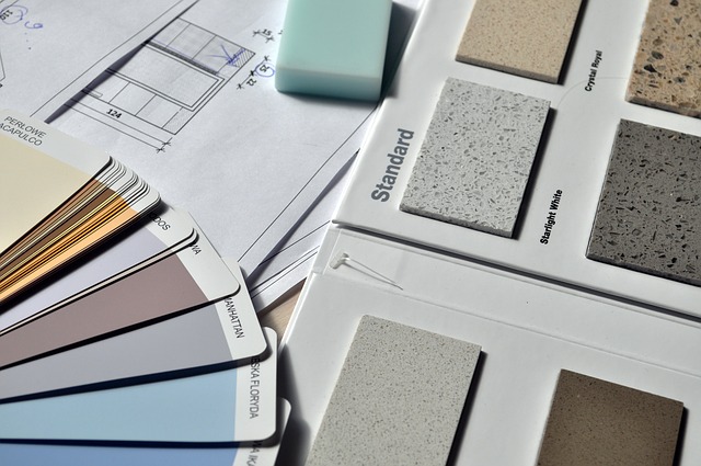
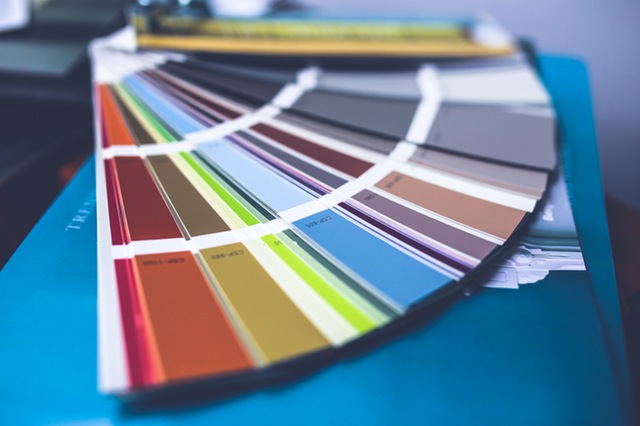
When looking through magazines and websites most people don’t realize that colours can show up differently on a phone/tablet/computer screen than they appear in person. The same applies to magazine photos as well. Certainly these are great places to start and get ideas for colour. A colour consultant, however, has many paint sample chips in larger sizes, which give a more accurate representation of the actual colour.
Also, colours will look a little different depending on
how much natural light a space gets
what direction the windows face
what type of lighting is used (LED, incandescent, fluorescent, etc.)
A colour consultant can take all these factors and direct you to colours that will complement the space.
A colour consultant works with all the different colours in the room
Many times, when painting your Toronto home, there will be certain elements that won’t change, such as flooring, a treasured painting, or cabinets, perhaps. A colour consultant will take these things into consideration and design a colour palette that will complement the colour of these items.
A colour consultation minimizes the chance of making a wrong colour choice
Perhaps the most important factor is that hiring a colour consultant minimizes the risk of choosing a wrong colour. Having an hour long session would be less than 5% of the cost of a typical painting project. Investing 5% of the total paint job on a colour consultation minimizes the likelihood of a wrong colour choice and having to redo an entire paint job! It always costs less to do things right in the first place than have to redo something that you’re not happy with.
Final thoughts
At CAM Painters, there are a few trusted colour consultants that we refer our clients to based on their individual needs. Why don’t you book a quote? We’d be happy to address your painting needs and provide you access to a colour consultation so that you can Transform Your Home With Lasting Beauty!
Many people find choosing a colour for their home to be a very daunting task. Here are a few tips to make sure that you’re happy with your colour selection.
Start by looking at design magazines or design websites
Leaf through some design magazines and see what pictures you like. When you see a picture that you like, cut it out and put it on a board. Or if you’re online save it to a “colour ideas” folder in Evernote, or some similar app.
As you accumulate some pictures you’ll see what colours you’re drawn to and that will give you a starting point for the next two suggestions.
Use a colour consultant.
Most interior designers offer colour consultation services. Also, some paint stores have colour consultants on staff who will do an in-home visit. We at CAM Painters have trusted colour consultants that we can refer you to if you need a recommendation.
These are wise investments, why?
you can be more confident with your colour selection,
you can step outside your comfort zone with your colour choice and still have the assurance that your colour selections will work with your existing furnishings,
having to repaint an entire room due to a bad colour choice will be more expensive than hiring a colour consultant in the first place.
Always do test patches
Get a sample paint tester from the paint store. Most paint stores offer paint testers, which are small containers of paint (less than a quart). They are usually priced around $10.
Once you get your colour sample it’s important to do the following:
Do a sample that’s large enough – make it at least 1’x1′
Apply 2 coats – you want to make sure that the colour is showing true and that the colour underneath is not showing through
Put samples on different walls – light hits each wall differently, even in the same room, so you’ll want to put a sample patch on a couple of different walls
Look at the samples at different times of day – morning light, afternoon light and artificial light make colour look different, so you’ll want to make sure you look at the sample in different lights
Once you’ve taken these steps you should feel very confident with your colour selection!
If you need any assistance with the colour selection process let us know, and why not schedule a quote for your painting project? CAM Painters will Transform your home with lasting beauty!